
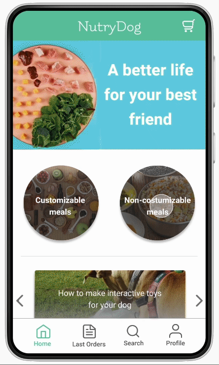
Nutrydog - natural food for puppies
Year /
2021-2022
This project was developed during the first five months of the Google UX Design Professional Certificate program. In it, I worked in all stages, from conception to delivery.
Challenge: Providing a balanced and healthy meal for dogs requires time and specific knowledge.
Solution: Develop an app that makes natural canine food more accessible through a delivery system.
How do tutors feed their dogs?
During the project, research was carried out with two focuses: understanding competitors and understanding the user. For the first case, a competitive audit was carried out, analyzing the strengths and weaknesses of direct and indirect competitors in the canine natural food industry.
So, with a better understanding of what is on the market, interviews were conducted and, with the findings, a persona and user journey map were created.
Competitive audit
In the competitive audit, interaction aspects such as resources, accessibility, user flow and navigation of competitors' websites were analyzed. The content available on each page and its visual aspects were also analyzed.
With that, it was possible to have a notion and, thus, a north of how my project should look and what it should offer.
Interview
Interviews were conducted with three dog owners. Some of the questions asked were:
- What do you know about dog food?
- What kind of food do you offer your dog? Because?
- What prevents you from offering a natural and balanced diet?
In order for the research results to be satisfactory and to help in design decisions, it was also necessary to define what the interviews were trying to discover.
Goals
How much do people know about canine nutrition?
What kind of food do people generally feed their dogs and why.
What prevents people from offering natural food to their dogs.
Discoveries
The points presented below showed why pet owners do not offer natural food to their dogs due to the complexity of such a way of feeding.
1
Takes time
Planning and preparing canine meals takes considerable time.
3
Expensive
Typically, fresh dog food is expensive compared to dry dog food.
2
Knowledge
Proper proportions of different types of food such as meat, offal and leaves must be followed to create a healthy and balanced ration.
4
Hard to store
As foods of this type are fresh, refrigeration is necessary, which makes storage difficult.
"I'm not sure to what extent these so-called natural foods are really healthy and (I believe) that a natural diet would be great for the dog, but it's a lot of work"
Adriano
33 years old, engineer and dog owner
Personas
Personas are fictional characters developed from interviews and research. They are important because they help keep the design focused on the user.


Idealization
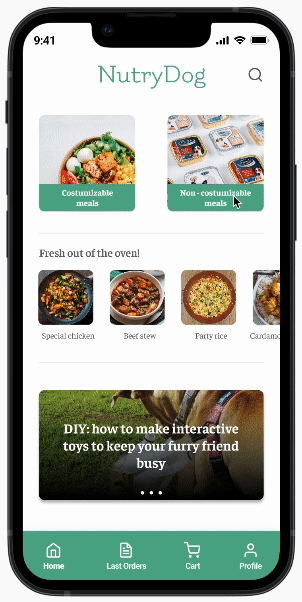
The main flow for the purchase of a non-customizable meal for dogs was developed.
Paper wireframes
Paper wireframes allow for multiple iterations quickly and easily. They helped me visualize which elements could work well together.


Design, testing and iterations
The main flow of the purchase of a non-customizable meal for dogs was developed. During the project, two usability tests were carried out to ensure that the product was easy and intuitive for users. The first test was done on the low-fidelity prototype and the second on the high-fidelity prototype.

low fidelity prototype

high fidelity prototype
Discoveries
Usability Test #1
1
The "order again" button was not very visible on the homepage
two
The "reorder" button has been relocated to the top of the page so that it is more visible.
Before

After

2
The caption on the meals page was not very intuitive
Before
After


The identification of where the user was in the app was changed from buttons to the system of tabs.
Usability test #2
1
The contrast of the buttons to start the purchase process was not high enough
The contrast of meal buttons and their respective captions has been increased.
Before

After

2
Sometimes the user just wants to see their last order without necessarily ordering again
Before
After
The "reorder" button has been relocated to a new horizontal menu. In addition, the old orders page has been redone, so that the user can only view old orders.
Optimizing the purchase flow
About six months after the release of the first version of the NutryDog app, it became apparent that an update was needed to meet the expectations of modern users. As part of an academic project, I had the opportunity to redesign the interface, focusing on optimizing the purchasing process.
After analyzing the original version, a solution was proposed that aimed to make the user journey more intuitive and efficient. To validate the hypothesis, A/B tests were conducted, comparing the original version with the new interface.
Methodology

Proposed changes
One of the app's main problems, in addition to its rude appearance, was that the user was unable to add more than one product to the cart directly from the dining page. The main changes made focused on solving this problem.
Original version
In the first version of the app, the purchasing process had a limitation: the user was forced to click "see more" for each product and only then add it to the cart, one at a time. The option to add multiple products to the cart was only available on the cart page, increasing the number of clicks and making the user journey longer.
New version
Unlike the previous version, the second version offers users more autonomy in choosing the quantity of products. The user can now adjust the desired quantity at three different points during the purchase process: directly in the meal list, on the detailed product page and in the cart itself.
Usability testing
To conduct the usability test, five participants were invited to simulate the purchase of two standard meals in both versions of the application. The sessions were recorded and the collected data was documented and analyzed.

Usability Testing Notes Spreadsheet
Quantitative data
The graph below illustrates the time, in seconds, that each participant took to complete the task in both versions of the app. The green bars represent the time spent on the original version, while the gray bars correspond to the time spent on the new version.

Time on task for each user
There was an average reduction in time of 37%.
“I really liked it because you can add more items directly to the cart, because in the other (version) you had to click on 'see more' to add. [...] if I wanted 30 items, I would have to click on 'see more' 30 times, or just in the cart, add more"
Anna Gontijo
25 years old, doctor and dog owner
The value is in the way
One of the app's main problems, in addition to its rude appearance, was that the user was unable to add more than one product to the cart directly from the dining page. The main changes made focused on solving this problem.
What this journey taught me
-
Continuous Iteration as an Engine for Improvement
The development of NutryDog has demonstrated that continuous iteration is key to creating digital products that evolve with users. By incorporating user feedback at every step of the process, we are able to deliver a more relevant and satisfying product.
-
Flexibility and Adaptation
Developing NutryDog has shown me the importance of flexibility in design. The ability to quickly adapt the product based on new information and user needs was key to ensuring the app evolved along with user needs.
-
Feature Prioritization
I learned to balance customer expectations with real user needs. This ability to prioritize was essential to avoid resource overload and ensure a more focused product.
Next steps
Consumable meals
The next step in Nutrydog's development will be the development of a customizable meal section, which will allow users to choose ingredients, portion sizes and even dietary restrictions.